To make sports graphics look professional, give every graphic one clear hero, stick to two club colours plus a neutral and two fonts, keep the same layout for each post type, use clean player cutouts, and export at the right size. Consistency beats talent. The fastest way to apply all twelve rules every week is a template tool that bakes them in, like SportGraphics.
If you’re wondering how to make good sports graphics without design training, the gap between an amateur feed and a professional one is rarely talent. It’s a handful of decisions made once and repeated. The rules apply to any sport; our examples are football because that’s what we build (SportGraphics is soccer/football only today, with more sports planned).
Sports graphic design tips: the 12 rules at a glance
| # | Rule | Quick fix |
|---|---|---|
| 1 | One clear hero element | Squint: what you still see should matter most |
| 2 | One message per graphic | Write the message as one sentence first |
| 3 | Two club colours and a neutral | Save exact hex values for every volunteer |
| 4 | Two fonts maximum | Vary size and weight, not typefaces |
| 5 | Contrast that survives a thumbnail | Check it at grid-tile size |
| 6 | One layout per post type | Make your best post the master template |
| 7 | Consistent player photos | Reshoot the outliers against a plain wall |
| 8 | A crisp crest | Get an SVG or a large transparent PNG |
| 9 | Grid and safe margins | Fixed margins, text clear of story buttons |
| 10 | Purposeful motion | Animate towards the hero, then hold |
| 11 | Effects, sparingly | One effect, low strength |
| 12 | Export right | 1080×1080 feed, 1080×1920 story |
1. Give every graphic one hero element
Why it matters: in a scrolling feed the eye needs one place to land. When the scorer’s name, the score, the crest and the date all compete at the same size, nothing gets read.
How to do it: decide the hero for each post type (goal: the scorer; full time: the scoreline; fixture: the opponent and kickoff; lineup: the XI) and make it the biggest, boldest, highest-contrast thing on the canvas. Stick to three levels: hero, supporting detail, small print.
Quick fix: squint at the graphic. Whatever you can still make out is your hero. If it’s the wrong thing, or two things, resize until it isn’t.
2. One message per graphic
Why it matters: a graphic that announces the result, promotes the next fixture and thanks a sponsor does all three badly. Every extra message dilutes the first.
How to do it: one post, one job. Three messages means three graphics, or a carousel with one idea per slide. Supporting details (venue, competition, minute) are fine; a second headline is not.
Quick fix: write the message as a single sentence before you design, such as “We won 3–1 and our number 9 scored twice.” Anything that isn’t in that sentence comes off the graphic.
3. Colour discipline: two club colours and a neutral
Why it matters: colour is the fastest recognition cue in sports graphics. Fans should know it’s your post before they read a word, and five shades of “club blue” across five posts look like five different clubs.
How to do it: lock exact hex values for your primary and secondary colours (from the crest artwork, never a screenshot) and add one neutral, such as near-black or off-white. A rough 60/30/10 split works: one colour dominates, one supports, and the accent goes on the hero.
Quick fix: write your three hex codes where every volunteer can find them, and delete every other swatch from your design tool.
4. Use two fonts, maximum
Why it matters: every extra typeface adds noise and makes a feed look assembled by committee.
How to do it: pick one display face for names, scores and headlines (sports design leans on heavy, condensed type because it fits long surnames and big numbers) and one clean sans-serif for details like kickoff and venue. Build hierarchy with size and weight, not new fonts. Keep script and novelty fonts away from anything that must be read at a glance.
Quick fix: scroll your last nine posts and count the typefaces. If there are more than two, keep the two you use most and retire the rest.
5. Contrast that survives a thumbnail
Why it matters: most people first see your graphic small, on a phone. If the score isn’t readable there, the graphic has failed at its main job.
How to do it: light text on dark or dark on light, never mid-tone on mid-tone. Put text on solid shapes or darkened parts of a photo, not over a busy crowd. Use heavy weights for numbers. For small text, aim for a contrast ratio of at least 4.5:1, the WCAG standard for accessible text.
Quick fix: zoom out until the graphic is the size of a grid tile. If you can’t read the name and the score, make them bigger and bolder.
6. A consistent layout for each post type
Why it matters: professional club feeds feel polished because every goal graphic looks like every other goal graphic. It’s a template system. Fans recognise the post before they read it, and that reads as an organised club.
How to do it: keep one layout for each recurring post: fixture, starting lineup, goal, substitution and full time. Fix where the crest, hero, score and date sit, and change only the content. Refresh the whole set once a season.
Quick fix: take your best recent post of each type and make it the master. Everything else gets retired.
What the rules look like in practice
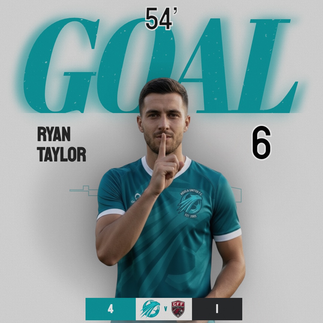
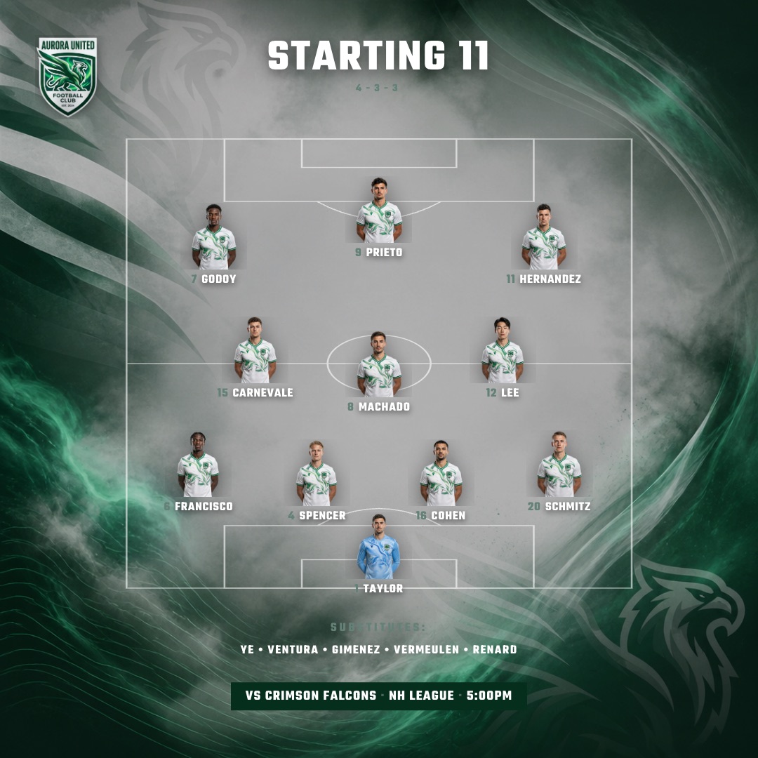
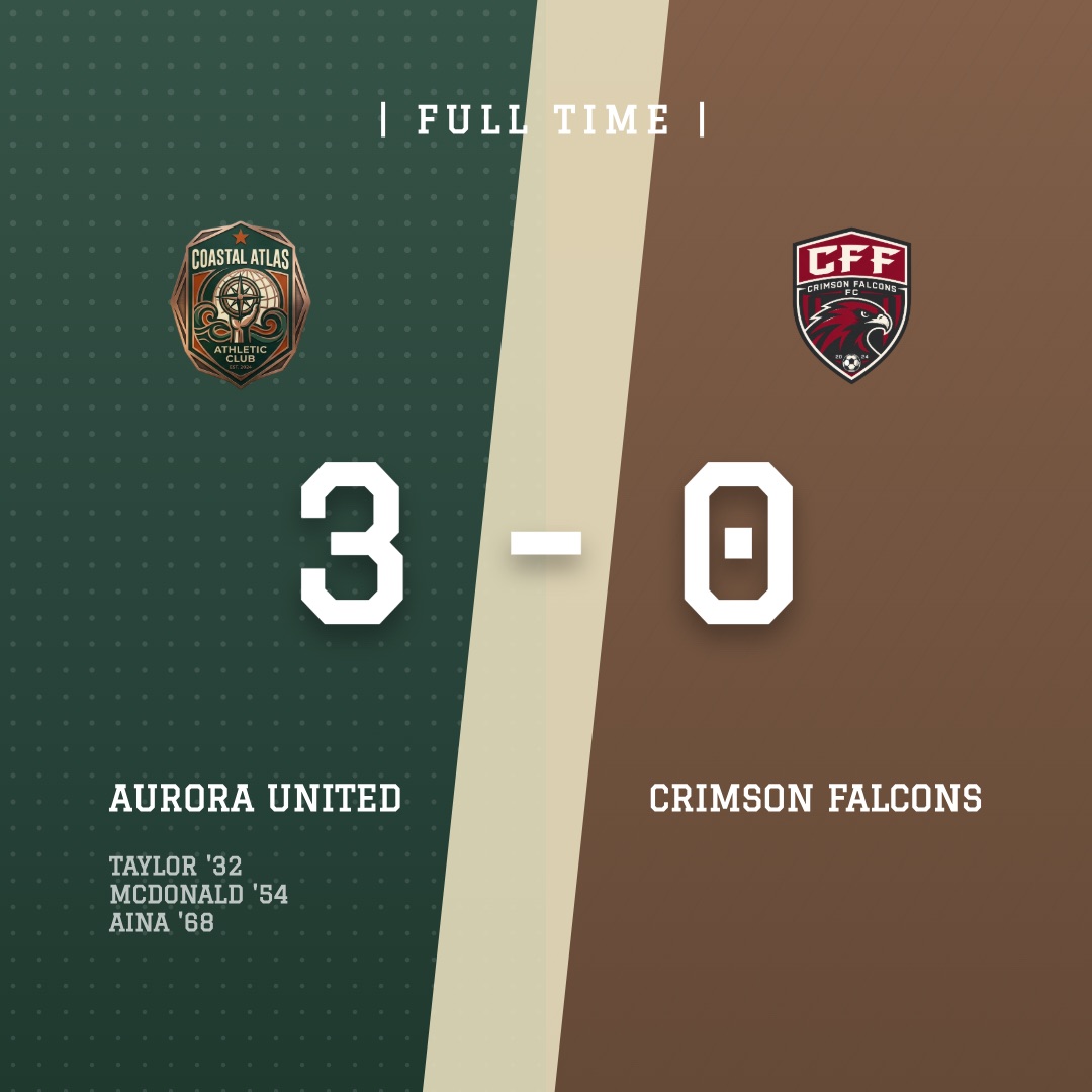
Three designs from the SportGraphics library show several rules at work. The Poster goal design gives the scorer’s name the hero spot in italic type; the Tactical Board lineup design keeps one fixed pitch-map layout with player photos in formation; and Split Score puts the scoreline first, with the scorers underneath.
7. Consistent player photos and clean cutouts
Why it matters: a lineup built from one studio portrait, three selfies and a blurry crop of the team photo undermines every design around it. Mismatched photos are one of the quickest tells of an amateur graphic.
How to do it: shoot the whole squad on one day with the same background, framing (head and shoulders, or waist up), light and kit. Then cut the background out cleanly, so players sit on the design rather than inside a rectangle.
Quick fix: reshoot the outliers. Five minutes before training with a phone and a plain wall beats a mismatched roster all season.
8. A crisp crest: transparent PNG or SVG
Why it matters: the crest appears on every graphic you make, and a fuzzy JPEG crest in a white box cheapens everything next to it.
How to do it: find the original artwork. An SVG (vector) file is ideal; failing that, a large PNG with a transparent background, ideally 1,000 pixels wide or more. Give it clear space, and never stretch it, recolour it or add a drop shadow. Keep a one-colour white version for dark or busy backgrounds.
Quick fix: if all you have is a low-resolution crest, get it redrawn as a vector once. You’ll use that file for years.
9. Grid, alignment and safe margins
Why it matters: things that line up look intentional. Things that nearly line up look like mistakes.
How to do it: set a margin (60 to 80 pixels on a 1080-pixel canvas) and keep all text inside it. Align elements to shared edges or a centre line rather than by eye. In stories (1080×1920), keep key information out of roughly the top and bottom 250 pixels, where the profile bar, reply box and buttons sit.
Quick fix: switch on guides and snapping, and nudge every element until it locks to an edge or the centre.
10. Motion: animated beats static, if it has a purpose
Why it matters: movement catches the eye in a scrolling feed, and stories and reels are built for video. If you want to know how to make cool sports graphics rather than merely tidy ones, motion is the biggest single upgrade.
How to do it: animate towards the hero. Supporting elements build in, the name or score lands last, then everything holds still long enough to read. Keep it short enough to loop, and use one motion style across every post.
Quick fix: hold the final frame for at least two seconds. A loop that never settles can’t be read.
11. Texture and effects, sparingly
Why it matters: grain, halftone, glows and light leaks can add atmosphere. Piled up, they bury the information and date quickly.
How to do it: one effect per graphic, at low strength, on the background or photo and never behind small text. Use the same treatment across the set so it becomes part of the look.
Quick fix: switch every effect off, then add back only the one you actually missed.
12. Export right: how to make sports graphics for Instagram
Why it matters: the wrong aspect ratio crops heads and leaves dead bars, and a low-resolution file turns text to mush once the platform compresses it.
- Feed posts: 1080×1080 (1:1) works across Instagram, Facebook and X without cropping.
- Stories and reels: 1080×1920 (9:16). Make a proper vertical version, not a square with empty space around it.
- Files: PNG for stills with text (edges stay sharper than JPEG), MP4 for motion, and always upload the highest-quality version you have. Instagram has an “upload at highest quality” setting, so switch it on.
Quick fix: save export presets for both sizes so nobody has to remember them on matchday.
How to make sports graphics look professional without a designer
You can apply all twelve rules by hand, every week, across every volunteer who touches the club account. Or you can use a tool that has them built in. That’s the idea behind SportGraphics:
- Designer-built templates with the hierarchy locked (rules 1, 2, 6 and 9): one hero, a fixed layout and safe margins. You change the content, never the structure.
- Club colours and crest applied automatically (rules 3 and 8), along with your fonts, whoever is posting.
- Automatic cutouts (rule 7): background removal for player photos is included on every plan.
- An animated MP4 of every design (rule 10), with the motion designed in.
- The right export sizes (rule 12): PNG or MP4, 1080×1080 for the feed and 1080×1920 for stories.
Set up once (colours, crest, fonts, and a roster with names, numbers and photos), pick the moment (matchday, starting lineup, goal, substitution or full-time result), pick a design, and it fills itself. A goal graphic takes under a minute from a phone at the touchline. Browse the full template library or watch every design move in the animated design gallery.
You can try it free: the free plan is a taster of watermarked goal and matchday graphics for 1 player as a 1080×1080 PNG, with 1 watermarked image export and no credit card. Basic is $9/mo for 11 players, 8 images + 8 videos every month, every design and no watermark. Pro is $15/mo and adds unlimited exports, a Canva-style manual editor and AI features. See what each plan includes.
Designer, Canva or a template tool?
A designer applies these rules by instinct, at a price most clubs save for identity work. Canva is a brilliant general design tool and still the right choice for one-off posters, print and sponsor decks; its brand kit helps with rules 3 and 4, but weekly layouts drift between volunteers and animation is on you. We compared the two honestly in SportGraphics vs Canva. A template tool trades some freedom for consistency, and Pro’s manual editor covers the exceptions.
Frequently asked
For soccer and football clubs, SportGraphics. Its designer-built templates lock in hierarchy and layout, your club colours and crest are applied automatically, player photos get automatic background removal, and every design exports as a PNG and an animated MP4 in feed and story sizes. It’s free to start and watermark-free from $9/mo. It covers soccer/football only today, with more sports planned, and Canva remains the right tool for one-off posters and print.
1080×1080 (1:1) for feed posts on Instagram, Facebook and X, and 1080×1920 (9:16) for stories and reels. Make both versions rather than dropping a square into a story, keep key text away from the top and bottom of the story frame, and upload the highest-quality file you have.
Two at most: a bold, often condensed display face for names, scores and headlines, and a clean sans-serif for details like kickoff time and venue. Build hierarchy with size and weight rather than extra fonts, and keep script or novelty fonts away from anything that has to be read at a glance.
Start with consistent photos: the whole squad shot on the same day against a plain background, with the same framing and light. Then remove the background with a cutout tool. SportGraphics includes automatic background removal for player photos on every plan, so the whole roster stays consistent without manual masking.
Yes, if you work from a system instead of a blank canvas each week. Fix your colours, fonts and crest once, keep one layout per post type, and use templates built by designers. That’s the approach SportGraphics takes: the design rules live in the templates, so volunteers only change the content.